![]()
Beautiful Plants For Your Interior
“Will it actually look like my pet?”
Every time a pet parent sends a photo, I feel that silent worry. I feel it too—especially when facing a tabby cat with its own “built-in filter” or a dog with a complex, swirling merle coat.
Most people think creating custom stuffed animals is as simple as picking a yarn that’s “close enough.” But after years of staining my cuticles with dyes and hand-combing raw New Zealand wool, I’ve learned the hard way: it’s never that simple.
Light has its own moods. Color depends entirely on how light plays with texture; the pigment doesn’t just sit on the surface, it “bites” into the fibers. This is why we don’t just “pick” colors; we perform a secondary reconstruction of the material itself.
You’ve seen them—mass-produced custom plush toys finished in under a month. They rely on off-the-shelf industrial shades, resulting in something that feels cold and rigid, like a stiff plastic model. A true custom pet gift should capture the fluid, layered shadows of a living animal, not a flat, lifeless block of color.
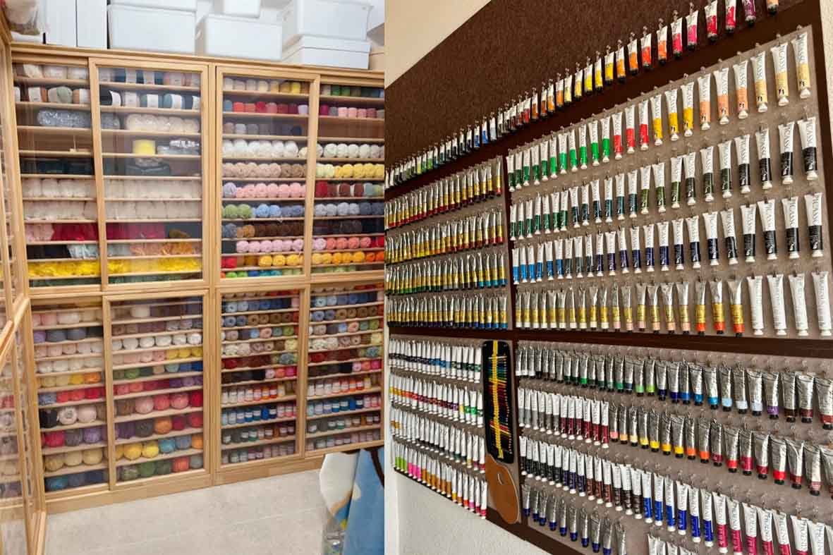
This is why I stopped “choosing” colors and started deconstructing them. Within our library of 200+ hand-mixed shades, I work like an oil painter—testing and layering—until I finally capture that specific hint of caramel hidden behind the tip of an ear.
When people say, “The color feels off,” they’re rarely talking about hue alone. What they’re noticing is the absence of transition.
In real fur, there are no hard borders. A realistic cat doesn’t wear stripes like stickers. The darker lines soften into warm grays, then dissolve into lighter underlayers you barely notice until the light shifts. The same happens in a realistic dog with merle or sable patterns—what looks like one color from afar is actually five or six fibers blended unevenly on purpose.
When I build custom stuffed animals, I don’t start with color blocks. I start with layering. I blend wool the way painters mix pigments on a palette, pulling apart fibers and recombining them until the shade feels unstable in the right way. Too perfect, and it dies. Too flat, and it loses breath.
Sometimes I’ll step back, squint, even turn the piece toward the window just to see if the shadow still moves across the surface. If it doesn’t, I know something is wrong.
Pet lovers aren’t just looking for resemblance. They’re looking for recognition—that quiet moment when they tilt their head and think, yes, that’s my cat… that’s my dog.
And that only happens when every strand carries intention.
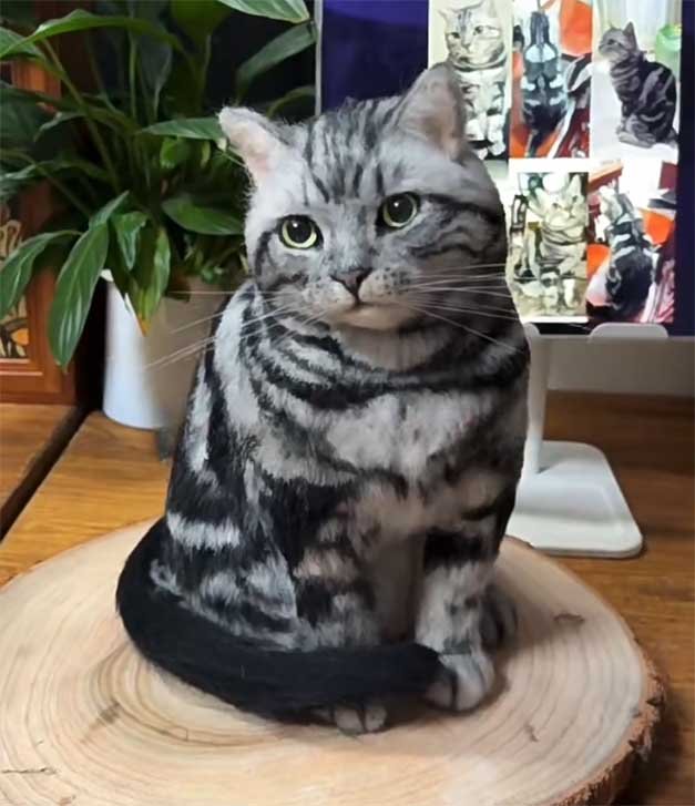
A messy tabby only looks chaotic at first glance. If you sit with it long enough, the pattern starts to organize itself.
When working on a Realistic Cat, I don’t begin by inserting wool. I begin by dividing space. The stripes become natural boundaries. Using fine scissors, I mentally map each section—shoulder, flank, spine—before committing to fiber. If you rush this part, the coat will confuse you. Tabby markings have rhythm, and once you lose that rhythm, it’s difficult to regain.
After lightly marking guidelines with an air-erasable pen, I anchor the darker fibers deeper into the base. Only then do I introduce gray or cream tones over the top. I trim carefully—not to shorten the fur, but to allow subtle undertones to surface.
For larger pale areas, I rarely rely on a single shade. A 2:1 or sometimes 3:1 blend of black and white wool creates a gray that feels alive under shifting light. When working through gradients along the back, I adjust incrementally—adding lighter fibers strand by strand. Too much at once, and the surface collapses into flatness.
This level of restraint is what separates thoughtful craftsmanship from mass-produced custom stuffed animals. Patterns are not painted lines—they’re transitions built through patience.
Because in the end, tabby stripes don’t need to be sharp.
They need to breathe.
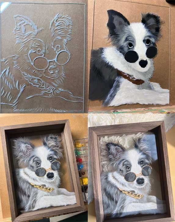
Merle coats are trouble. They look soft in photos, but when you actually try to rebuild them, they fight you. The gray isn’t just gray. It shifts. Sometimes I think I’ve matched it, then I step back and it looks dead. That’s usually where the mismatch starts.
When I work on custom stuffed animals with Blue Merle or merle Border Collie coats, I stop thinking in blocks of color. I start thinking in pressure. In restraint. In how much the wool will tolerate before it flattens.
I still use the same three brushes every time—000#, 0#, and 1#. They’re worn down and slightly uneven now. The 1# helps me place the middle tones. The 0# adjusts direction. The 000# is risky. Too much pressure and the fiber collapses. Too little and the pigment just floats.
For the base, I don’t perfectly mix deep gray, pale gray, and cream. I load them together and let them settle unevenly. Sometimes it works. Sometimes I wipe it off and try again. The transition only feels right when I can’t see where one tone ends.
With complex coats, layering isn’t about adding more paint. It’s about correcting what you just did. That’s the difference in our custom stuffed animals. Not more color—just more control.
People usually notice the pigment before they notice the sculpture. A faint gray under my nail. A thin blue shadow along the cuticle. Those stains aren’t accidents. They’re leftovers from hours of testing tones that almost matched—but not quite.
Our color library didn’t appear overnight. It grew slowly, one stubborn adjustment at a time. Adding a drop of warm cream to cool down a harsh silver. Muting black with smoke so it doesn’t swallow the light. On paper, it sounds technical. In practice, it’s just repetition. Mix. Test. Dry. Check again in different light.
For complex coats—especially merle patterns—200 shades is not excess. It’s survival. Without that range, custom pet gifts risk looking flat or generic. With it, the fur carries depth, memory, and those subtle shifts that remind pet lovers of the real animal they love. Some of those mixes never make it into a final piece. They sit on drying cards, labeled and reconsidered months later. The stains on my hands stay longer.
Materials matter. Wool quality matters. Oil density matters. But trust doesn’t come from materials alone.
Pet lovers who commission custom stuffed animals usually send more than photos. They send stories. “Her ears were darker in winter.” “His fur looked almost blue in morning light.” Those details don’t show up in a standard color chart. They require listening first, mixing later.
Our color lab is less about chemistry and more about restraint. It’s knowing when not to brighten a coat. It’s knowing when to leave a transition slightly imperfect because that’s how real fur behaves. Authenticity hides in those small irregularities.
That’s why people trust the process. Not because we promise perfection—but because we respect the difference between matching a color and honoring a memory.
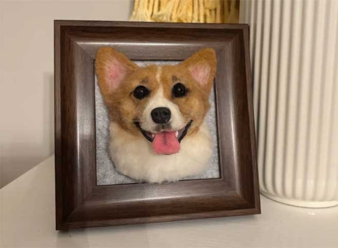
A1: To be honest and professional: no, we do not aim for a 100% “pixel-perfect” clone. Because this is a hand-sculpted art form using natural fibers and hand-mixed dyes, we focus on achieving an 85-95% resemblance. Our goal is to capture the “soul” and the unique color logic of your pet rather than creating a cold, industrial replica. Each piece is a unique tribute with the warmth of a handmade touch.
A2: Complex coats are our specialty, but they are also the greatest challenge. Even with our library of 200+ shades, slight tonal variations are inevitable. We use a manual blending technique to mimic natural transitions, aiming for the closest visual match possible. Please keep in mind that wool fibers react to light—the color may look slightly different under your home’s warm lighting compared to our studio’s professional setup.
A3: Our color matching relies entirely on the photos you provide. For the best results (hitting that 90%+ similarity mark), please send 5-10 high-resolution photos taken in natural daylight without filters. We use these as a reference to find the “common denominator” of your pet’s true coat. Clear, unedited photos help us minimize the gap between the screen and the physical wool.